

Is your homepage a leaky bucket?
Fix these common conversion mistakes
You check your website analytics. Traffic is coming in. But your calendar? Still too empty.
Sound familiar?
When visitors land but don’t reach out, you’re dealing with what I call the leaky bucket.
The frustrating part: it’s not one obvious thing that’s broken. A homepage that converts needs the 5 Foundations all working together. If one piece is off, the whole structure leaks.
The good news: when your homepage stops leaking, everything feels lighter. You feel confident sending people to your site. The right clients start reaching out. Less hustle, more ease.
This blog post goes into 3 proven strategies to fix this problem.
Key takeaways
Why start with the homepage
There are dozens of ways a website can leak authority and conversions. Service pages, testimonials, contact forms, about pages: all of these matter.
But when I audit a client’s website, I always start with the homepage.
For many solopreneurs, most visitors will land here. Because it’s the link on your social media profiles, your business card, your email signature.
(Even if you’re working mainly with landing pages, read on because the 3 strategies below still apply.)
The homepage is where first impressions form and where people decide whether to keep exploring or leave. If the homepage isn’t working, nothing else gets the chance to. A strong homepage won’t fix everything, but a weak one will quietly undo all the good work happening on other pages.
All three strategies below focus here. Small, focused changes on your homepage can make a noticeable difference in how your entire website performs.
Strategy #1: Fix the “vague hero” problem
Your hero section has one job: help visitors understand what you do within eight seconds.
What I see over and over is well-intentioned vagueness. Homepages that open with poetic lines like “Unlock Your Potential” or “Designing the Future.” They sound nice, but they don’t answer the only question that matters: Is this for me?
When people can’t immediately tell who you help and how, they don’t stick around. They bounce.
Confusion here doesn’t just feel awkward. It costs inquiries, booked calls, and real opportunities.
One of my clients, leadership coach Dror Yaron, had a moment that made this impossible to ignore. He watched a potential client scroll through his website while she was narrating her confusion out loud.
“Nothing like watching someone get lost on your digital doorstep to wake you up.”
— Dror Yaron, Leadership Coach
A strong hero section is built on clarity, not cleverness. It communicates who you help, what you help them with, and the result they can expect, then offers one obvious next step.
On Dror’s redesigned website, that clarity looks like this:
Leadership coaching for business humans
Lead your business and your life according to your values.
→ Let’s talk
For my own business:
Sustainable web design for solopreneurs
Get a website that positions you as the go-to expert in your field.
reThink the Web is the one-person web design studio for coaches, consultants and service providers. Let’s partner up to co-create a website you’re proud to own and share.
→ Work with me
This isn’t about being boring. It’s about respecting your visitor’s time. Clear beats clever.
This is also where expertise quietly shows. Experts guide. They don’t make people guess. When your message is clear right away, you demonstrate leadership before a single conversation happens.
Quick check: Show your homepage to five people in your target audience who don’t know your work. Give them eight seconds. Ask them to explain what your business does. If they struggle, hesitate, or guess, this section needs work.
Strategy #2: Remove what slows you down
This isn’t just about making your site faster. It’s about how your website feels to someone landing there for the first time.
Heavy-weight components like
- full-width images
- auto-playing background videos
- excessive tracking scripts
all add friction. They increase load time and create subtle delays that visitors feel before they consciously notice them.
Data shows that a site loading in 1 second can have a conversion rate 3× higher than a site loading in 5 seconds.1
A slow homepage doesn’t just frustrate people. It quietly pushes them away.
If you work in sustainability or social impact spaces, this matters even more. Your clients know that sustainable, privacy-friendly website exists by now. A bloated, resource-heavy website sends subtle signals that something is off. A fast, clean site reinforces trust and aligns your values with your actions.
Lightweight websites convert better because they feel calm and intentional. Performance isn’t just technical. It’s part of the user experience.
If you like to learn more about this, I wrote an in-depth article about why a sustainable website is better for business.
Auto-playing videos and sliders might look impressive, but to visitors they often signal distraction and noise. Removing them is one of the fastest ways to reduce friction and make your message feel more confident.
If your message is strong, you don’t need fancy tricks.
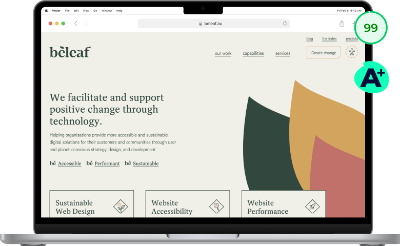
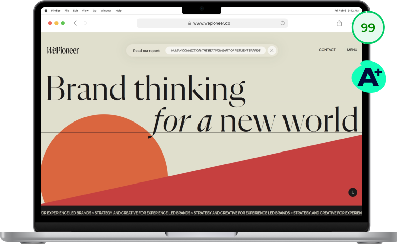
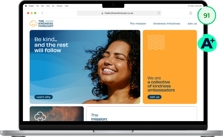
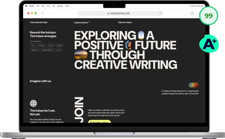
Four examples of lightweight websites with high visual impact (#1 and #2 actually use some animations, but they’re subtle). As you can see, they all have an A+ carbon rating, and a performance score of 90%+.

beleaf.au 
www.wepioneer.co 
thekindnessforecast.co.uk 
futurestories.club
What these sites have in common isn’t a trendy look. It’s restraint. They load quickly, the message is clear, and nothing competes for your attention.
You don’t need a hand-coded website to achieve this. I regularly reach the same performance results using WordPress in ways that are flexible, scalable, and easy for clients to manage.
When I redesigned the IMMA Collective website, performance improvements led to:
- Load time: from 11.9 seconds to 0.6 seconds (95% faster)
- CO₂ emissions per page view: from 0.53g to 0.06g (89% lighter)
That shift doesn’t just make a site greener. It changes how the site feels. Faster load times signal competence. A lighter footprint signals intention. Together, they reinforce authority before a single word is read.


You can read the whole story about IMMA Collective’s brand reFresh and website reLaunch in my portfolio.
Quick check: Open your homepage on your phone with WiFi off. Does it feel sluggish? Run it through PageSpeed Insights. If your performance score is below 80, friction is costing you.
Strategy #3: Give visitors three doors, not thirty
Long service lists.
Multiple client audiences.
Navigation menus packed with options.
When a homepage tries to show everything, visitors have to do the hard work of deciding what matters.
Many won’t. They’ll skim, feel unsure, and quietly leave.
So let’s take a look at the psychology behind things here:
This problem usually comes from a good place. You want visitors to see everything you offer so they can find what they need. But when people feel overwhelmed, they don’t choose the best option. They don’t choose any option. This is the paradox of choice and decision paralysis at play.
This is where The Three-Door Framework comes in.
Instead of asking visitors to sort through all your offers, you guide them toward a small number of clear paths. Our brains love patterns, and three feels complete without being overwhelming.
Those three doors might be:
- Mode of delivery: Done for you, done with you, and done by you
- Client types: solopreneurs, small businesses, larger companies
- Client needs: Coaching for individuals, teams, and peer groups
- Service depth: Project work, retainer work, and one-off consultations
Below an example from the Ethics.Coach website which uses the “client needs” version of this.

I describe how we arrived at this solution starting form 6+ different offer variants in the full case study for the Ethics.Coach reLaunch.
The goal isn’t to oversimplify your work. It’s to make the first decision easy. Once a visitor chooses a door, then you go into detail.
If you serve distinct audiences, you can also help visitors self-select early on. Two clear calls-to-action can lead each group to a page that speaks directly to their needs, without forcing them to wade through irrelevant information.
Navigation plays a big role here too. Fewer menu items almost always lead to better outcomes. This isn’t about hiding information. It’s about leading visitors to a clear overview, then letting them go deeper if they choose.
On Dror’s redesigned website, visitors see three clear entry points: coaching for individuals, teams, and peer groups. Each is presented as its own card, and the navigation mirrors these same paths. The homepage feels calm, intentional, and guided instead of crowded.
Quick check: Count the choices you’re asking visitors to make on your homepage. If you have more than three offer buckets or more than five navigation items, you’re likely overwhelming people. Fewer choices signal confidence.
Let’s recap
If your homepage feels like a leaky bucket, focus on these three things:
- Get clear in your hero section. Help visitors understand who you help and how within eight seconds.
- Remove friction. A fast, lightweight site signals competence and keeps people engaged.
- Use three doors. Guide visitors with fewer, better choices instead of overwhelming them.
When these pieces work together, your homepage stops leaking. You feel confident sharing your site, the right clients reach out, and your marketing supports your business instead of draining your energy.
If your main issue is clarity in your hero section, you may be able to fix it yourself with focused work. But if you’re dealing with two or three of these issues at once, that’s usually a sign your business has outgrown DIY fixes.
Your next step
Want expert eyes on your homepage? That’s what my Website Check is for.
I’ll review what’s working, where authority is leaking, and what would make the biggest difference right now. You’ll get clear, prioritized recommendations you can act on immediately.
Just €90. 100% human. 0% AI.
- source: Portent blog ↩︎