

Can you really create a showstopping website with sustainable design?
You talk about sustainability, accessibility, ethical business. Your clients hire you because of those values. But your website? It doesn’t prove any of it.
It’s not just the visuals. It’s that the site itself contradicts what you stand for. Heavy pages, cookie banners, inaccessible layouts, a design that screams template. None of that signals “go-to expert.” And it’s certainly not filtering for the well-paying, values-aligned clients you actually want to work with. You know the site needs to change. You’ve probably known for a while.
The reLaunch, my done-for-you website redesign, is built for exactly this moment: when your expertise, your offers, and your reputation have outgrown the website that’s supposed to represent them. In 6–10 weeks, we turn your DIY site into a professional, sustainable online presence that positions you as the expert you already are.
But there’s one concern I hear a lot before someone says yes:
“Can you really create a showstopping website with sustainable design? I’m worried that a ‘low-carbon’ website will look plain, boring, or not feel high-end.”
That’s a fair concern. When you’re selling premium services, your website has to match that level. You don’t want it to look stripped down or underwhelming just because it’s sustainable.
So let’s clear this up.
This post breaks down what sustainable web design actually means, why the “boring” myth exists, and how a sustainable website can absolutely look high-end. Not to sell you on The reLaunch at all cost, but to help you make a grounded decision about whether it’s the right fit.
Key takeaways
Why “sustainable = boring” feels true
If you look around the web right now, most websites are trying very hard to outshine each other. Full-width background videos. Huge images. Animations flying in from every direction. Fancy transitions. Layers upon layers of “wow.”
And if you’ve talked to other web designers, you may have heard things like:
- “Animations signal trust.”
- “You need video in your hero section.”
- “People expect a flashy experience now.”
So when you hear the word sustainable, it’s easy to assume it means less. Minimal. Stripped back. Maybe even boring.
It doesn’t help that there aren’t many sustainable websites showcases (yet). So how would you know what they can look like?
On top of that, the word “sustainable” can be a trigger word. For some people it means “good for the long term but not exciting.”
Here’s what I mean when I say “sustainable” web design.
I use sustainability as an umbrella term for five practices that reinforce each other:
- Financially sustainable: A site you own, with low overhead, that actively supports your revenue.
- Eco-friendly: Lean, performant pages that consume less energy and produce fewer carbon emissions.
- Accessible: Design that includes everyone, regardless of ability or circumstance.
- Ethical: Marketing that’s straightforward, respects privacy, and doesn’t manipulate.
- Long-term viable: Architecture that holds up over years, not just until the next redesign.
If you want to know more and learn why you should care about these, read Why a sustainable website is better for business
But that concern — that sustainable means sacrificing beauty — is based on a misunderstanding of what’s actually driving web design right now.
The “bigger is better” web is already cracking
Yes, many websites today are shiny and fancy.
But here’s a truth most people don’t talk about: every year, websites are getting bigger and heavier. According to the State of the Web report by HTTP Archive, the total number of bytes per page keeps increasing year after year.
At the same time, the internet isn’t magically getting faster at the same rate.
This is what’s often called a rebound effect: as technology improves, we use more of it, which cancels out the gains.
The consequences are real:
- More energy use
- Slower load times
- Frustrated visitors
- Higher bounce rates
- Worse accessibility in areas with slower connections
And here’s the part that matters most for your business: your clients don’t mistake “slow and overwhelming” with “high-end.” They associate expertise with clarity, confidence, and ease.
A website that loads quickly, guides them smoothly, and communicates your value clearly feels professional. It feels considered. Intentional.
That’s the kind of experience that shifts sales conversations from “convince me” to “when can we start?”
Sustainable design isn’t about stripping your site down. It’s about removing what doesn’t serve your user or your goals. That’s not boring. That’s strategic.
The Big Fancy Website Myth benefits designers more than you
Here’s something many people don’t realize: even most web designers don’t deeply understand sustainable design.
Why? Because sustainable design sits at the intersection of design, development, UX, and performance. Many designers focus primarily on visuals while many developers focus mainly on code and performance.
There’s also an industry bias toward the “wow effect.”
Portfolios are often optimized to stop the scroll. Agencies want work that looks impressive at first glance. And yes, designers want projects that look exciting in their showcase.
But what looks impressive in a portfolio isn’t always what works best for users. Features like background videos, heavy animations, or content flying in from different directions can actually make a website harder to use. They can distract from your message instead of supporting it.
This is where designers get mad …
I recently shared a post on LinkedIn about not putting full-width background images or autoplay videos in your hero section. And the comments started rolling in.
Note: To read the comments go straight this way.
Some designers reacted as if I had said “no more images” or “no more videos” on websites at all. But that wasn’t the point: The real discussion around image formats, compression, placement, and purposeful use eventually happened in the comments. That’s the conversation worth having.
If I had to summarize the problem, it’s this: When someone doesn’t understand the technical side (image optimization, performance budgets, loading strategies), it’s easier to frame the topic as black and white: “Sustainable means no video.” ↔ “High-end means adding video to explain yourself.”
Neither is true.
You don’t need a big, fancy website to be perceived as premium. You need a clear, considered one.
(And if that includes a video of you introducing yourself or of a client giving a glowing testimonial, great! Just put it lower on the page, optimize it and add a play button.)
And if you’re interested what to put in your hero section, read: Is your homepage a leaky bucket? Fix these common conversion mistakes.
The truth: Sustainable websites can be visually interesting
There are many sustainably designed websites out there that look great.
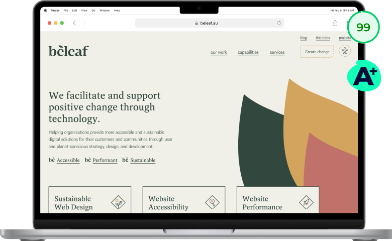
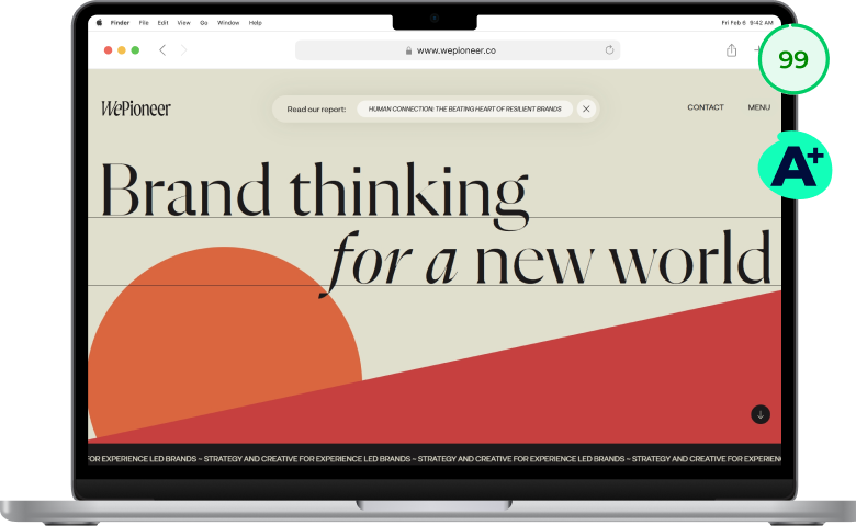
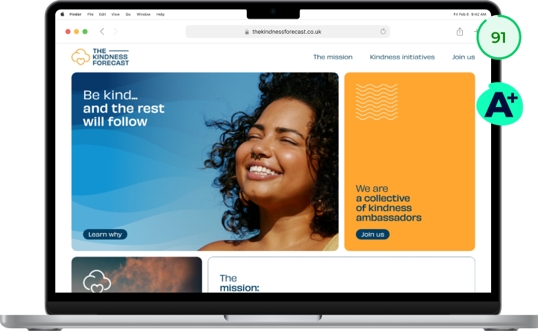
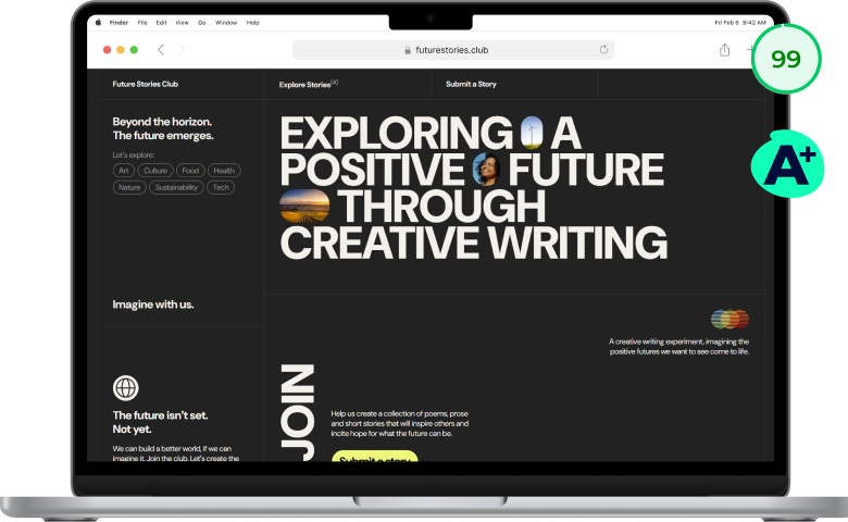
Here are four lightweight websites with high visual impact. All of them have an A+ carbon rating and a performance score above 90%.

beleaf.au 
www.wepioneer.co 
thekindnessforecast.co.uk 
futurestories.club
Websites like these use thoughtful typography, strong layouts, creative cropping, color overlays, and graphic elements to create visual interest without heavy elements.
Some of them even use subtle animations. Others use well-placed, optimized images and video. A sustainable website can absolutely include beautiful landscape photography, brand videos, portrait images, and rich visuals.
Need more sustainable web design examples?
Take a look at my friend Sandy’s website Green the Web. She curates a best-practice library of lightweight websites.

What these sites have in common isn’t a trendy look. They load quickly, the message is clear, and nothing competes for your attention.
It’s about being deliberate rather than copying what everyone else is doing.
Sustainable does not equal plain. It equals smart.
How The reLaunch balances visual impact with performance
So how do you get a website that looks premium and runs lean? That’s built into The reLaunch at every phase.
Phase #1 Strategy: Design based on your audience, not trends
We don’t start with visuals. We start with strategy.
In this phase, we look closely at your audience, your business model, your marketing funnel, and your premium offers. We determine what your audience actually needs in terms of content and design to feel trust and alignment.
I recently worked with a client who serves nature brands and travel agencies. She told me:
“I love your minimal style. But my audience needs to see landscapes, nature, animals. Can we still do that?”
Absolutely.
My brand uses minimal illustration for two reasons:
- My audience needs to see that minimal design doesn’t mean boring.
- To make the colorful portfolio pieces of my clients’ websites the star of the show.
But her audience connects emotionally through imagery. So of course we keep powerful images.
It’s not about “you can’t have that anymore.” In the strategy phase we ask: does this serve your audience and your goals? That’s how we create a site that filters for fit and values alignment before someone even books a call.
Phase #2 Branding: More visual interest, less data
This is one of my favorite parts of the process.
Because this is where I get to use design skills to make your website more interesting while reducing page weight and improving performance.
Some of the ways we do that:
- Reduce color variation. Black-and-white, duo-tone, or images with overlays can look striking while using less bandwidth.
- Creative cropping. Cutting off image edges into shapes reduces file size and adds personality.
- Blurred or softened areas. This reduces pixel complexity and draws attention to what matters.
- Layered design elements. Combining smaller images with background shapes or graphic accents creates impact without heavy files.
Project Insight: Ethics Coach
In a recent project for Ethics.Coach Dror Yaron, instead of placing square portrait photos on the page, we created playful collages with organic shapes and hand-drawn accents.

The result: smaller image files, faster load times, more visual personality, and a stronger brand presence. The constraints actually pushed the design further than a standard photo layout would have. In Dror’s words:
Stefanie transformed the website into a welcoming experience. Low carbon footprint. Accessible. Ethical. Beautiful. Apparently you can have it all.
— Dror Yaron, Leadership Coach
If this project sounds interesting, read the full case study on the Ethics.Coach project.
Phase #3 Website: Where design meets development
There’s a real difference between a designer-only approach and a designer-developer approach.
As a “Full-stack web designer” working at the intersection of design, UX, and performance, I’m not just thinking about how something looks. I’m thinking about how it loads, how it behaves, how it guides your visitor, and how it supports your sales funnel.
For images alone, I use 16 different strategies across four categories inspired by the R-Strategies of Circular Design:
- Refuse: Saying no to heavy elements like sliders that load multiple large images at once and add heavy code.
- reThink: Getting creative and deliberate with how visuals are used.
- Reduce: Scaling, compressing, and using web-optimized formats.
- Recycle: Removing images you’re not even using anymore.
Only one of these categories (#2) is purely about visual creativity. The others are about UX and development.
This is how we create a website that is eco-friendly, accessible, and works for your business. Not trendy for two years. Strategic for the long run.
What changes when your website matches your values
Your website loads quickly.
It feels calm, confident, and clear.
It reflects your sustainability values for everyone to see.
Right-fit clients land on your site and think: “This is exactly the kind of expert I want to work with.” Instead of explaining your pricing, you’re discussing start dates. Instead of attracting tire-kickers, you’re attracting people who already understand your value.
And you feel proud sharing your link. Not apologizing for it.
That’s what happens when your website becomes a case study for how you work: thoughtful, considered, values-led, and high-level.
Ready to see what’s possible for you?
If you’re a few years into your business and your DIY website no longer matches your expertise, let’s talk.
Inside The reLaunch, we spend 6–10 weeks transforming your site into a strategic, sustainable, high-end online presence that attracts right-fit, premium clients.
The next step is simple: book a Clarity Call. We’ll look at your current website, your goals, and whether this approach is the right fit for you. Because you don’t have to choose between sustainable and showstopping. You can have both.
You can find information on how your data is processed in my privacy policy.